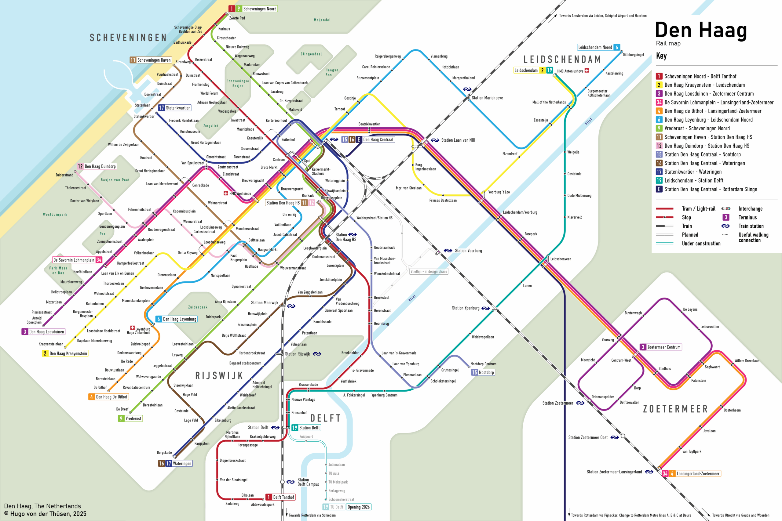
This map was mentioned in a recent blog on transitmap.net. Read it here
The Hague (Den Haag) has a great tram system: it’s historic, extensive, and modern. Unfortunately the official HTM map does not reflect that. It is oriented the wrong way, cluttered with unnecessary information, and lacks a coherent design. In order to use a map for articles about The Hague I also needed a map without copyright which led me to design my own.
Visually it’s more appealing but in practice it’s not as useful, although that wasn’t goal regardless. The font is smaller and less legible and it’s a simplified map, not a diagram. However it’s perfect for my use case and it fits my visual style and identity.
Click image to enlarge, article continues under the map
My map is oriented with north at the top, which places the famous beach in the correct position. The uniquely gridded layout of The Hague’s suburbs is reflected in the design, with lines radiating from the city centre at equal distances. Angles of 45 degrees are used consistently, and all curve radii are standardized. Zoetermeer and Delft are now visibly separated from The Hague by green spaces signalling that they are different cities on the same network.
Future-proofing is also built in for the line 19 extension to the TU Delft campus and for the Vlietlijn in the Binckhorst area. Metro Line E is also given more importance as it is physically part of the network and used by many in the region.
In the future, I would like to experiment with different line colours. An Amsterdam-style approach, where trunk routes are distinguished by colour hue, could work well for The Hague. In the longer term, I would also like to revisit this project to improve the balance: the left side of the map is currently quite cluttered, while the right side feels empty. I have tried filling that space with the key, but enlarging the line in The Hague or exploring a different canvas format might provide a better solution. Increasing the label size and reshaping the map will be the next part of this project.
